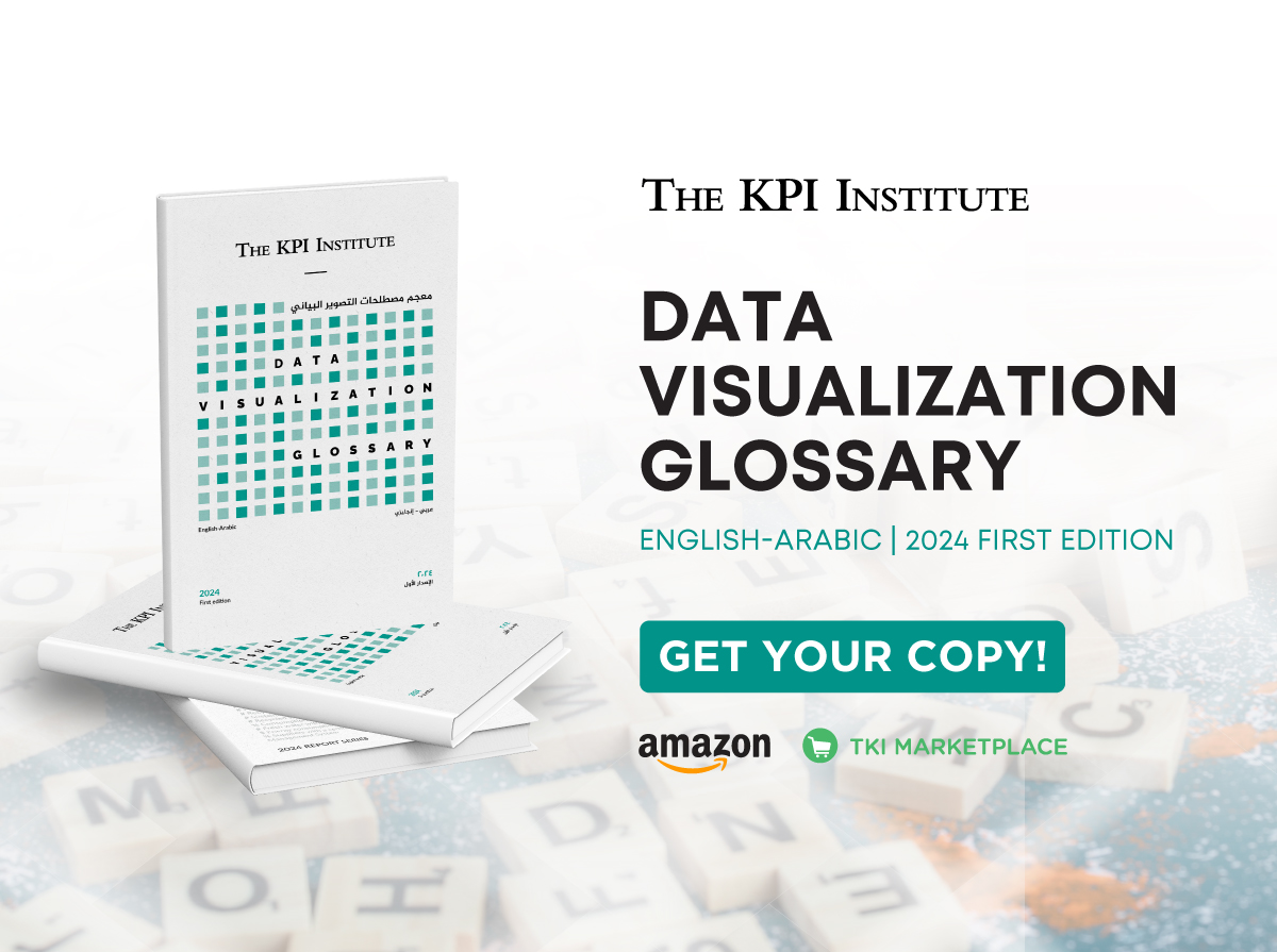
Five must-know terms from The KPI Institute’s Data Visualization Glossary and their Arabic translations
April 9th, 2025 Posted by Kimberly Tilar Publications 0 thoughts on “Five must-know terms from The KPI Institute’s Data Visualization Glossary and their Arabic translations”
Clear communication is the cornerstone of effective data visualization. However, the language we use to describe visual tools often suffers from ambiguity, especially when terms are translated without consideration of their intended function or context. Recognizing this challenge, The KPI Institute developed a Data Visualization Glossary, not just to define terms but to reimagine them for Arabic speakers in a way that preserves clarity and purpose.
In crafting the Arabic version of this glossary, The KPI Institute didn’t simply translate English terms word-for-word. Instead, they first refined the definition, distilling each term’s essence, and then created an Arabic equivalent that reflects the concept as clearly and familiarly as possible for native speakers. The result is a carefully cultivated glossary in which each Arabic term stands independently, free from being a mere counterpart to another language.
Furthermore, the glossary is structured into three main sections for ease of use: Contextual Index, Terms and Definitions, and Arabic-English Index. This ensures readers can navigate the content intuitively, whether looking for a specific term or exploring broader concepts.
In this article, let’s dive into the five must-know terms from the glossary and how they’ve been thoughtfully translated into Arabic.
In the process—almost like starting from scratch—The KPI Institute took the opportunity to untangle the overlapping use of certain English terms often used interchangeably without clear distinctions. Terms like chart, graph, and diagram tend to blur into each other, leading to confusion. To bring clarity, here are the deliberate distinctions made by The KPI institute:
-
- Chart – A visual representation that conveys values of qualitative or quantitative variables.
Context: Data reporting channels
رسم بياني – رسم يعبر عن قيم متغيرات نوعية أو كمية
السياق: وسائل عرض البيانات
-
- Diagram – A conceptual drawing without qualitative or quantitative values, used to illustrate abstract ideas and concepts.
Context: Data reporting channels
مخطط نظري – رسم نظري لا يضم مرمزات لقيم نوعية أو كمية، يستخدم لتوضيح الأفكار والمفاهيم المجردة
السياق: وسائل عرض البيانات
-
- Graph – Anything drawn for explanatory purposes, which may rely on data values as a chart or simply illustrate theoretical concepts as a diagram.
Context: Data reporting channels
رسم – أي شيء مرسوم بغرض التوضيح، قد يعتمد على قيم بيانية فيكون رسًًما بيانًًّيا، أو لا يعتمد إلّا على مفاهيم نظرية فيكون مخطّطًا نظريا
السياق: وسائل عرض البيانات
In addition, the glossary carefully distinguishes more commonly confused terms, such as the difference between grid and gridlines.
-
- Grid – An imagined network of vertical and horizontal lines, visualizing them on the drawing space helps to divide it and distribute the design elements according to clear templates.
Context: Grid elements
شبكة الخلفية – شبكة متخيلة من خطوط عامودية وأفقية، يساعد تخيلها على فراغ الرسم على تقسيمه وتوزيع عناصر التصميم وفق قوالب واضحة
السياق: عناصر شبكة الخلفية
-
- Gridlines – Vertical and horizontal lines on charts using the Cartesian system, extending from tick marks on the x and y-axes across the chart area. Gridlines aid in comparing data points to axis values and may be omitted if data values are directly labeled.
Context: Data visualization elements
See also: Axis – Tick mark – Data label
خطوط الخلفية – خطوط رأسية وعامودية في الرسوم البيانية المعتمدة على النظام الديكارتي، تنطلق من علامات التجزئة على محوري السينات والصادات وتمتد لآخر مساحة التمثيل البياني. تفيد في تسهيل مقارنة مكان النقاط البيانية بقيم عالمات التجزئة. يفضل التخلص منها إن كانت النقاط البيانية يسهل معرفة قيمتها من دون مقارنتها بقيم عالمات التجزئة، غالًًبا باستبدال التوضيحات البيانية بها.
السياق: عناصر التصميم البياني
انظر أيضًا: محور، عالمة تجزئة، توضيح بياني
This clarification enhances precision in understanding and usage. To discover more essential terms and their contextual Arabic translations, explore the Data Visualization Glossary by The KPI Institute. It is available on the TKI Marketplace—download yours today!