
Posts in Courses

How to turn confusing charts into clear business insights

October 9th, 2026 Posted by Certifications, Courses 0 thoughts on “How to turn confusing charts into clear business insights”

Organizations rely on charts, dashboards, scorecards, and reports to communicate performance and support business decisions. Yet a visualization can contain accurate data and still leave its audience struggling to understand what the results mean.

A crowded dashboard may hide an important performance gap. Inconsistent colors may confuse comparisons. A chart without clear labels may leave readers guessing what the numbers represent.

These problems are not always caused by the data itself. The way information is organized, presented, and communicated also affects how easily people can interpret it.

Data visualization helps people understand the significance of data by placing it in a visual context. It can reveal patterns, trends, and relationships that might be difficult to recognize in tables or text alone.

The challenge is to present information in a way that supports understanding rather than adding another layer of complexity.

Here are five practical principles for turning business data into clearer visual insights.

1. Start with the question, not the chart

Opening Excel or a dashboard tool and immediately choosing a chart is tempting. However, the first step should be to identify what the audience needs to understand.

Are you comparing performance across departments? Tracking changes in customer satisfaction? Examining differences between actual and target results? Showing how several categories contribute to a total?

The answer determines how the information should be organized and presented.

For example, imagine that a sales manager wants to compare the performance of five regional teams. A table can list each team’s results, but a bar chart may make differences easier to spot. If the manager wants to understand how sales have changed over the past 12 months, a line chart may communicate the trend more clearly.

The same dataset can support several visualizations, but each should serve a specific purpose.

Before selecting a format, consider these questions:

  • What do I want readers to understand? Identify the main finding, comparison, or relationship.
  • Who will use this information? Consider the audience’s familiarity with the subject and the level of detail they need.
  • What decision or action could the information support? Determine whether the visualization needs to highlight a performance gap, explain a trend, or compare alternatives.
  • Which format communicates the information most clearly? Choose a chart, table, infographic, dashboard, or another visual communication format based on the objective.

Try this: Before creating your next chart, write a one-sentence description of what the audience should learn from it. If you cannot define that message, clarify the purpose before proceeding.

2. Use visual hierarchy to guide attention

A visualization communicates through more than numbers. The position, size, color, and form of its elements influence what readers notice first.

This is why visual hierarchy matters.

Consider a performance dashboard containing 15 KPIs. If every number appears in the same font size, every chart uses equally prominent colors, and every section competes for attention, readers may struggle to identify the most important findings.

A stronger design establishes a clear order. The most relevant information receives greater prominence, while supporting details remain available without dominating the page.

Several design principles can help:

  • Emphasis: Give the main finding a distinct visual treatment so readers can identify it quickly.
  • Hierarchy: Arrange information according to its importance, using titles, headings, size, and position to establish priorities.
  • Contrast: Create sufficient differences between important elements and their surroundings.
  • Balance: Distribute visual elements so the layout feels organized rather than crowded on one side.
  • Consistency: Apply similar spacing, alignment, and formatting to related elements.

For example, a monthly performance report might begin with three headline indicators: overall performance, the largest deviation from target, and the most significant change since the previous month. Supporting charts can then explain the results in greater detail.

The objective is not to hide information. It is to make the main message easier to find.

Try this: Reduce your dashboard to a grayscale view. Can you still identify the most important information from its size, position, and layout? If everything appears equally prominent, reconsider the hierarchy.

3. Use color with a clear purpose

Color can distinguish categories, communicate differences, and draw attention to specific results. However, an attractive palette does not automatically produce an effective visualization.

The key is to establish a consistent relationship between color and meaning.

Suppose a company uses green for performance above target, amber for results close to target, and red for results below target. If these colors retain the same meaning across its reports, readers can interpret the results more quickly.

If the same colors represent unrelated categories in different charts, however, readers may misinterpret the information.

The Datawrapper guide to choosing colors for data visualization offers practical advice on color selection, contrast, gradients, and accessibility.

Apply these principles to business reporting:

  • Use consistent colors for the same categories. If a department is represented in blue in one chart, retain that color when showing the same department elsewhere.
  • Reserve accent colors for important findings. Use neutral tones for supporting information and stronger colors for the results that deserve attention.
  • Match the palette to the data. Use distinct hues for unrelated categories and ordered color gradients for numerical values that progress from low to high.
  • Explain what the colors mean. Add labels or a legend when the interpretation is not immediately clear.
  • Check readability and accessibility. Make sure that text and data points remain distinguishable against their backgrounds and that meaning does not depend on color alone.

For example, a dashboard could use neutral colors for most KPIs and a contrasting accent to highlight indicators that fall below their targets. This approach helps readers focus on exceptions without making every result compete for attention.

Color should support the message, not become the message.

Try this: Review one of your existing reports. If you remove half the colors, does the information become easier to interpret? If so, simplify the palette and reserve stronger colors for the most important distinctions.

4. Make the structure, typography, and labels work together

Even a well-chosen chart can be difficult to interpret when its layout is confusing or its labels are hard to read.

Structure determines how information is arranged. Typography affects readability and emphasis. Labels, titles, and annotations explain what the visual elements represent.

These components need to work together.

Imagine a chart showing monthly customer complaints. The data is accurate, but the title says only “Customer Data,” the reporting period is missing, and the category labels use internal abbreviations. Readers may have to consult the surrounding report before they can understand the chart.

A few adjustments can make a substantial difference.

  • Give the chart a specific title. Instead of “Customer Data,” use “Monthly Customer Complaints, January–June 2026.” The revised title tells readers what they are looking at and establishes the period covered.
  • Place labels close to the information they explain. Direct labels can reduce the need to move between chart elements and a separate legend. Where a legend is necessary, keep it clear and easy to locate.
  • Use typography consistently. Establish a small set of font sizes and styles for titles, section headings, labels, and supporting text. Avoid decorative fonts or excessive variations that compete with the data.
  • Include units and relevant context. Specify whether a figure represents percentages, currency, hours, or absolute counts. When a comparison depends on a target or baseline, make that reference clear.
  • Use annotations to explain important changes. A short note can identify an unusual spike, a change in reporting methodology, or an event relevant to the data. The annotation should provide context without making unsupported claims about causation.

The Datawrapper guide to using text in data visualizations explores these techniques, including direct labeling, readable typography, annotations, and straightforward wording.

For example, if customer complaints increased in March, a chart annotation could identify a new reporting procedure introduced that month. The note provides context, but additional analysis would still be needed to establish whether the procedure caused the increase.

Try this: Ask a colleague who has not seen your report to explain one of its charts. If they cannot identify the subject, period, units, and main finding without your help, revise the title, labels, or annotations.

5. Follow a process from raw data to a finished visualization

Effective data visualization is not simply a matter of styling a finished chart. It involves a series of decisions about the data, its purpose, its representation, and the way readers will interact with the result.

A practical process helps make these decisions more systematic.

The following seven stages provide a useful workflow for business reporting:

1. Acquire the data. Gather the information needed to answer the business question. Check that the sources are appropriate and that the reporting period is clear.

2. Parse the data. Examine the dataset’s structure, fields, categories, and measurement units. Understand what each variable represents before using it.

3. Filter the data. Remove irrelevant information and address missing, inconsistent, or duplicate records where appropriate. Keep the selection of data aligned with the question being investigated.

4. Analyze the data. Examine the figures for patterns, differences, relationships, and exceptions. Check calculations and consider whether the available information supports the intended interpretation.

5. Represent the data. Select an appropriate visual format and organize the information so the intended comparison or relationship is easy to recognize.

6. Refine the visualization. Review the layout, hierarchy, typography, colors, labels, and annotations. Remove elements that distract from the main message and correct anything that could mislead readers.

7. Add interaction where useful. Consider whether filters, tooltips, or interactive elements would help the audience explore the information. Use them when they serve a clear purpose rather than adding complexity for its own sake.

This process also highlights an important distinction: a technically correct chart is not necessarily an effective one. The visualization must represent the data accurately and communicate its meaning to the intended audience.

A final review before publishing

Before sharing a report, dashboard, or infographic, check the following:

The visualization answers a clearly defined question.

The selected format suits the type of information.

The main finding stands out without unnecessary decoration.

Colors, typography, and layout follow a consistent logic.

Titles, labels, units, and reporting periods are clear.

The figures and calculations match the source data.

The visualization does not exaggerate differences or imply unsupported conclusions.

The design remains readable and accessible to its intended audience.

The final output gives readers enough context to interpret the findings.

A useful final test is to ask whether the visualization communicates its main message without requiring the creator to explain every element. If it does, the design is doing its job.

Building data visualization capability

Creating effective visualizations requires more than knowing how to produce charts in Excel or assemble a dashboard. Professionals need to understand the data visualization process, select appropriate communication formats, apply design principles, and use structure, typography, and color to present information clearly. They also need to evaluate finished visualizations for accuracy, readability, and effectiveness.

The Certified Data Visualization Professional certification from The KPI Institute addresses these capabilities through a structured learning program. The course covers data visualization parameters, the visualization process, visual communication channels, layout and design principles, typography, iconography, color theory, and reporting formats such as scorecards, dashboards, and infographics. It also includes practical reporting exercises and the assessment of real-world visualizations.

For professionals who prepare performance reports, develop dashboards, or communicate business results, the program offers a structured way to develop data visualization knowledge and apply it to workplace reporting.

Learn more about the Certified Data Visualization Professional certification: https://kpiinstitute.org/data-visualization-certification-presentation/

The top 5 skills behind better data-driven decisions

October 1st, 2026 Posted by Certification, Courses 0 thoughts on “The top 5 skills behind better data-driven decisions”

Organizations have access to more business data than ever. Sales figures, customer information, financial results, operational metrics and employee data can all provide evidence for business decisions.

But having more data does not necessarily lead to better decisions.

The difference often comes down to the skills used to work with that data. Professionals need to know how to identify the right questions, prepare information for analysis, apply appropriate techniques and communicate what the results mean.

For organizations seeking stronger data-driven decision-making, these capabilities are becoming increasingly relevant.

Here are five skills that can help professionals make better use of business data.

1. Understanding the business problem

Effective data analysis starts with understanding what the organization is trying to solve.

A business question provides direction for the entire analytical process. It helps determine what information is needed, which variables should be examined and which analytical approach is appropriate.

Without a clearly defined problem, professionals can spend significant time processing data without producing findings that support an actual decision.

This makes business understanding an important foundation for data analysis. Analysts need to connect the information they are examining with organizational objectives, operational challenges and the decisions that need to be made.

2. Preparing and organizing data

Business data rarely arrives in a form that can immediately be analyzed.

Information may come from different sources, contain missing values or follow inconsistent formats. Data preparation involves organizing the information and identifying issues that could affect the reliability of the analysis.

Professionals therefore need to understand different data types, sources and collection approaches. They also need to recognize how data quality can affect the conclusions drawn from it.

Good analysis depends on having data that is fit for the question being investigated.

3. Applying the right analytical techniques

Knowing how to calculate a result is only part of data analysis.

Professionals also need to determine which technique is appropriate for the problem and the type of data available. Descriptive statistics can help summarize what has happened, while statistical testing can help assess whether observed differences or relationships are meaningful.

The objective is not to make an analysis unnecessarily complex.

It is to use an appropriate method and interpret the results correctly.

This requires familiarity with statistical concepts and analytical tools, as well as the ability to apply them within a business context.

4. Interpreting what the numbers mean

Data can show patterns, differences and relationships. Interpretation helps explain what those findings could mean for the organization.

Consider a business that notices a decline in sales in one customer segment. The number itself identifies a change, but further analysis is needed to understand whether the decline relates to pricing, customer behavior, seasonality, product availability or another factor.

This is where analytical thinking becomes important.

Professionals need to examine findings critically, consider the context and avoid drawing conclusions that the available evidence does not support.

A strong analyst does more than report numbers. They help others understand what the numbers are saying.

5. Communicating insights clearly

Even a technically sound analysis has limited usefulness if decision-makers cannot understand the findings.

Data analysts need to present information in ways that make important patterns and conclusions easier to identify. Tables, charts, statistical results and concise explanations can all help communicate findings to different audiences.

This skill becomes particularly important when working with managers and other stakeholders who may not have a technical background.

The goal is to move from “Here is what the data says” to “Here is what the data means for the business.”

Building practical data analysis capability

These five skills are connected. Understanding the business problem guides data collection and preparation. The quality and type of data influence the analytical techniques that can be applied. The results then need to be interpreted and communicated in a way that supports business decisions.

Developing these capabilities therefore requires more than learning individual statistical methods or spreadsheet functions. Professionals need a practical understanding of the broader data analysis process.

The Certified Data Analysis Professional and Practitioner certifications from The KPI Institute provide a structured learning pathway for professionals seeking to develop these capabilities.

The programs cover areas including business understanding, data collection, data preparation, statistical techniques, data analysis, interpretation and practical application. The Practitioner certification also focuses on applying analytical knowledge and tools within real business environments.

For professionals who work with business data or want to strengthen their analytical capabilities, structured data analysis training and certification can provide a practical way to develop these skills and apply them to organizational challenges.

Sign up for the Certified Data Analysis Professional and Practitioner certification:
https://kpiinstitute.org/certified-data-analysis-presentation/

ESG reporting is no longer optional. Where does the balanced scorecard fit in?

September 15th, 2026 Posted by Balanced Scorecard, Certifications, Courses, E-learning 0 thoughts on “ESG reporting is no longer optional. Where does the balanced scorecard fit in?”


Sustainability reporting has moved from a voluntary communications exercise to a regulatory obligation. Under the EU’s Corporate Sustainability Reporting Directive (CSRD), thousands of companies now face detailed, audited disclosure requirements on environmental, social and governance (ESG) performance — with similar expectations building through the ISSB standards internationally.

For many organizations, the instinct has been to treat this as a reporting problem: build the disclosures, satisfy the auditors, move on. A growing body of research suggests that framing is too narrow — and that organizations already running a Balanced Scorecard (BSC) are better positioned to meet these requirements as a matter of strategy rather than compliance.

Compliance is the floor, not the framework

A 2025 study in Management Decision makes this case directly. Examining how companies can operationalize the CSRD, the researchers propose implementing its requirements through a sustainability balanced scorecard, arguing that the exercise should integrate sustainability with corporate governance rather than sit alongside it as a separate disclosure workstream. Their proposed framework moves through four steps — identifying material themes, assessing current capability, formulating strategy and then reporting — deliberately placing reporting last, as an output of strategic work rather than its starting point.

That sequencing matters. Organizations that build ESG metrics only to satisfy disclosure rules tend to end up with indicators that are audit-ready but strategically disconnected — numbers that describe activity without informing decisions.

A well-established extension of a familiar framework

The idea of adapting the BSC for sustainability is not new; the “sustainability balanced scorecard” (SBSC) has been studied for over two decades. A 2025 bibliometric review of 247 publications on the subject found that the SBSC consistently strengthens organizations’ capacity to align sustainability goals with core strategic objectives, while also flagging persistent implementation barriers — chiefly, the difficulty of choosing sustainability indicators that are both meaningful and comparable across business units.

Sector-specific applications reinforce the pattern. A 2024 study of fast-moving consumer goods companies proposed a method for operationalizing ESG-adapted corporate strategy through the BSC’s four perspectives, translating climate and sustainability targets into the same cause-and-effect logic FMCG firms already use to manage financial and customer outcomes. Separate research on Indonesian manufacturing firms found that integrating ESG considerations into BSC design produced positive, statistically significant improvements in sustainability performance across all four scorecard dimensions — evidence that the framework does not need to be reinvented to absorb ESG, only extended.

It is not only a private-sector question

The pressure to link sustainability reporting to genuine strategic management extends beyond corporations. A 2025 study of local government organizations examined how municipalities are implementing ESG indicators within their balanced scorecards, finding that institutions incorporating sustainability into their performance frameworks — rather than treating it as a separate policy initiative — reported stronger policy coherence and citizen engagement. Leadership commitment and stakeholder participation emerged as the critical success factors, echoing what the private-sector research also finds: the framework only delivers value when it is genuinely used to manage strategy, not simply populated with new metrics.

The strategic risk of getting this wrong

None of this suggests ESG integration is straightforward. The same body of research is candid about where organizations struggle: selecting indicators that are material rather than merely available, avoiding a proliferation of metrics that dilutes strategic focus, and ensuring that sustainability targets are cascaded through the organization with the same discipline applied to financial ones.

That is precisely the discipline a well-designed Balanced Scorecard system is meant to enforce. The organizations best placed to meet ESG reporting obligations without derailing focus are, generally, the ones that already have a structured way of connecting objectives, KPIs and initiatives across the business — and are extending that same structure to sustainability, rather than building a parallel system for it.

Building the capability

As reporting requirements tighten and stakeholders — investors, regulators, customers — expect sustainability performance to be managed with the same rigor as financial performance, the ability to design and cascade a scorecard that genuinely integrates ESG becomes a strategic capability, not an accounting task.

The Certified Balanced Scorecard Management System Professional program from The KPI Institute equips participants to design, implement and cascade a Balanced Scorecard system built to hold up under exactly this kind of pressure — where strategy, KPIs and reporting obligations all need to move as one.

AI is changing strategy. What does agile execution look like now?

September 10th, 2026 Posted by Certification, Courses, Strategy 0 thoughts on “AI is changing strategy. What does agile execution look like now?”

Artificial intelligence is changing how organizations make decisions, allocate resources and respond to opportunities. But as the business environment becomes more dynamic, how should organizations adapt the way they execute strategy?

Artificial intelligence is moving beyond experimentation and into the core of business operations. The World Economic Forum’s Future of Jobs Report 2025 found that 86% of employers expect AI and information-processing technologies to transform their businesses by 2030. At the same time, the Forum identifies resilience, flexibility and agility among the core skills expected to remain important as organizations adapt to technological and economic change.

This combination creates a strategic challenge.

Organizations can use AI to process information faster, identify patterns and support decisions. But they still need the organizational capability to translate those insights into action.

And when the assumptions behind a strategy change, execution may need to change with them.

This is where agile strategy execution becomes particularly relevant.

AI can accelerate decisions. What happens next?

AI can give organizations access to new sources of information and new ways of working. Yet adopting AI does not automatically translate into better organizational performance.

A peer-reviewed study published in the International Journal of Information Management examined data from 205 supply-chain executives in the United States and found that AI assimilation was associated with organizational agility, customer agility and firm performance. The researchers also found that organizational and customer agility partially mediated the relationship between AI assimilation and firm performance.

The finding suggests that the organizational response to AI matters alongside the technology itself.

More recent research reinforces the connection. A 2025 study in Industrial Marketing Management examined 246 B2B firms in Australasia and found that AI-enabled systems can support innovation through improved decision-making performance, while strategic agility plays a significant role in the relationship between AI adoption, decision-making and innovation.

The implication for strategy professionals is straightforward: AI may improve the information available for decision-making, but organizations still need the ability to respond effectively to what that information reveals.

Agile does not mean changing strategy every time something changes

Agility is sometimes reduced to the idea of moving quickly or changing direction whenever something new happens.

For strategy execution, that interpretation is too narrow.

Agility can instead mean having a structured way to sense changes, evaluate their implications, take action and adjust implementation while maintaining strategic direction.

Consider an organization that launches a strategic initiative based on a particular customer process. Six months later, an AI capability makes part of that process significantly faster or less expensive. The strategic objective may still be valid, but the initiative supporting it may no longer be the most effective way to achieve it.

An execution-oriented organization needs to be able to recognize that difference.

Recent research supports this broader view of agility. A 2025 study published in Industrial Marketing Management found that organizational learning can contribute to strategic agility in volatile, uncertain, complex and ambiguous environments, with the researchers emphasizing continuous learning, decentralized decision-making and adaptability.

Agility, therefore, is not simply about speed. It is about the organization’s capacity to respond intelligently to changing conditions.

The execution problem is also a coordination problem

Strategy does not execute itself.

A systematic review in the European Management Journal describes strategy implementation as a dynamic and complex process through which managers and employees turn strategic plans into reality. The review identifies managerial actions, organizational conditions and dynamic managerial capabilities as important elements of effective implementation.

That means execution involves considerably more than approving a strategic plan.

People need to understand what the strategy means for their work. Resources need to be aligned with priorities. Different functions need to coordinate their efforts. Leaders need to monitor progress and intervene when implementation begins to diverge from strategic intent.

This becomes even more important when technology is changing rapidly.

A peer-reviewed study on strategy implementation and organizational agility found that organizational agility can influence managerial discretion, which in turn supports strategy implementation and unit performance.

In practical terms, organizations need enough structure to maintain strategic alignment—but enough flexibility to allow decision-makers to respond when circumstances change.

What should organizations actually monitor?

This is where performance measurement enters the picture.

A strategy needs more than objectives and initiatives. Leaders also need evidence that implementation is moving in the intended direction.

KPIs can provide that visibility.

When appropriately connected to strategic objectives, KPIs can help organizations monitor implementation, identify performance gaps and determine where management attention may be required.

In a rapidly changing environment, however, measurement should not become purely retrospective.

A significant change in a KPI can prompt a broader strategic question:

Does the original plan still make sense?

This creates a feedback loop between strategy and execution. Performance information does not simply tell an organization whether it achieved a target; it can also provide evidence for deciding whether an initiative, resource allocation or implementation approach needs to change.

This view is consistent with research published in Long Range Planning on strategy implementation, which conceptualizes implementation through practices including structure and process matching, resource matching, monitoring, framing and negotiating.

The result is a more dynamic understanding of execution: strategy provides direction, while implementation generates information that can inform subsequent strategic decisions.

Agile strategy execution is becoming a practical discipline

Recent research is also beginning to connect agile principles directly with strategy deployment.

A 2025 study published in Management Research Review examined strategy development and deployment within an automotive company through 39 semi-structured interviews. The researchers identified challenges involving process integration, communication, information quality, strategy mentality and coordination, and proposed an agile framework for strategy development and deployment.

This is significant because agile principles have often been associated with project or product development rather than the broader process of executing organizational strategy.

The emerging research suggests that the same underlying challenge exists at the strategic level: how can organizations maintain direction while responding effectively to new information and changing conditions?

For professionals responsible for strategy and performance, that requires a combination of planning, measurement, stakeholder engagement, monitoring and change management.

Building the capability to execute strategy

The Certified Agile Strategy Execution Professional (C-ASE) from The KPI Institute is designed around this challenge.

The program introduces a proprietary framework for strategy implementation and combines best practices with practical advice, process maps and implementation tools.

Participants develop capabilities to:

  • Use strategy planning tools
  • Deploy KPIs to monitor strategy implementation
  • Engage the right stakeholders in strategy execution
  • Monitor strategy implementation
  • Drive organizational change

The live-online certification involves 40 hours in total, including four hours of pre-course requirements, 20 hours of live online sessions delivered over five consecutive days, three hours for an Individual Learning Map, a one-hour certification exam and 12 hours of after-course requirements.

Participants also gain access to the international Certified Agile Strategy Professional Community and can pursue international recognition for their strategy execution skills.

The next question for strategy professionals

AI is changing what organizations can do. It is also changing the speed at which assumptions can become outdated.

The strategic challenge, therefore, is not simply adopting AI. It is developing the organizational capability to turn new information and capabilities into coordinated action—and adjust that action when circumstances change.

That is where agile strategy execution becomes relevant.

For professionals working in strategy, performance management and organizational transformation, developing this capability can help strengthen the connection between strategic objectives, initiatives, KPIs, stakeholders and organizational change.

Explore the Certified Agile Strategy Execution Professional →

Over 44,900+ professionals took TKI’s KPI and performance management courses. What did they learn?

August 26th, 2026 Posted by Certification, Courses, E-learning 0 thoughts on “Over 44,900+ professionals took TKI’s KPI and performance management courses. What did they learn?”

The KPI Institute recorded 44,900 participants across its educational programs as of the latest mid-year attendance record. Behind that figure is a community of professionals who have taken part in courses covering strategy, performance management and related areas through different learning formats.

The programs have reached professionals across multiple regions worldwide, with the Middle East accounting for the largest share of participants, followed by APAC, Africa, Europe, South America, and North America.

What are participants learning?

The KPI Institute serves professionals with different learning preferences, with face-to-face courses attracting the highest participation, followed by live online and pre-recorded formats. This mix reflects a combination of classroom-based and digitally accessible learning.

Certification represents an important part of the institute’s professional development offering, covering areas related to performance management, KPI management, strategy and business planning, data, and organizational performance.

Its international reach is reflected in activity across 60 countries, with more than 3,000 courses delivered as of the latest available data. This geographic spread highlights the accessibility of the company’s learning and certification offerings to professionals across different markets and organizational contexts.

Participation has also shown steady growth over the reporting period, increasing month by month from January through July. The latest available figure reached 44,900 participants, reflecting continued expansion of the institute’s global learning community.

The course portfolio covers a broad range of disciplines in strategy, business planning, performance management, and KPI development. Participants can develop skills in Strategic Planning, Strategy Execution, Business Planning, the Balanced Scorecard, Performance Management, Performance Measurement, Performance Management Systems, and Performance Maturity.

The portfolio includes specialized learning in Key Performance Indicators (KPIs), KPI Measurement and Reporting, KPI Target Setting, KPI Selection, and KPI Management, as well as Objectives and Key Results (OKRs). Together, these courses help professionals translate strategy into measurable objectives, establish appropriate performance measures, design management systems, and use performance information to support organizational improvement.

Moreover, the portfolio extends into employee performance, data, analytics, and decision-making, addressing the practical capabilities needed to manage and interpret performance information. Courses cover Employee Performance Management, Data Analysis, Data Visualization, Benchmarking, and Performance Reporting, alongside topics that strengthen the use of evidence in organizational decision-making. Participants learn how to work with performance data, identify meaningful patterns and comparisons, communicate insights effectively, and apply structured approaches to monitoring and improving results. Across the portfolio, the focus is on giving professionals practical frameworks, methods, and tools that can be applied directly to organizational performance and professional practice.

What graduates say

Participants have highlighted the practical and engaging nature of the learning experience. Meshal Almotairi, Senior Dietitian at the Saudi Food and Drug Authority, described the course as “a great learning and revision tool,” noting that the quizzes helped reinforce understanding and that the knowledge gained was valuable enough to share with colleagues.

Ibrahim Neyaz, Director of Business Process Management & Strategic Information Department at the Saudi Food and Drug Authority, similarly emphasized the practical focus, saying the course helped him understand KPIs and how to implement them within his organization. He particularly valued the real-life exercises, which enabled him to analyze how KPIs could be developed for different departments and aligned with strategic objectives.

The organizational impact of the learning is also reflected in the experience of Ferenc Gabor, Managing Director of Process Solutions S.R.L. Following training in the Balanced Scorecard and KPI areas, Gabor said his organization was “very pleased with the quality of the course and training” and was applying the knowledge gained within the company. These experiences point to the practical application of the institute’s training beyond the classroom, from strengthening individual understanding of performance concepts to supporting organizations in applying structured approaches to strategy and performance management.

For professionals looking to build similar capabilities, the full range of courses is available here:

How much time does a performance management certification take? And other questions

August 21st, 2026 Posted by Certification, Courses, E-learning 0 thoughts on “How much time does a performance management certification take? And other questions”

Considering a strategy and performance management certification can raise practical questions about registration, time commitment, certification requirements, interaction, support, resources, and technical requirements.

The KPI Institute’s FAQ for its 2026 worldwide live-online certifications addresses these questions.

How do I register for the course?

Similar to the open face-to-face programs, the online programs have an application and admission process in place. Participants are required to fill in the application form and process the payment for the course in order to register. A confirmation email will be sent once the registration has been completed.

How much time should I expect to allocate to complete all course requirements?

The total expected time is 40 hours. This includes:

  • Pre-course requirements: 4 hours
  • Live online sessions: 20 hours, 4 hours per day, for 5 consecutive days
  • Individual Learning Map and exam preparation: 3 hours, 0.5 hours per day after each live session, and 0.5 hours for the final recap before the exam
  • Certification Exam: 1 hour
  • After-course requirements: 12 hours

What will I receive upon completing the program?

The certification process is finalized only when all three stages of the learning experience have been completed. Participants will receive the following:

  • Certificate of Completion: After completing the pre-course activities and passing the Certification Exam
  • Certificate of Attendance: After participating in the online training course
  • Certified Professional diploma: After successfully completing all three stages of the learning experience
  • CPD Certificate of Attendance: Once Professional status has been successfully obtained

Will I be able to interact with the facilitator and other participants?

Yes. The learning experience is designed to encourage interaction. The facilitator will address participants’ questions and provide feedback during the sessions, as well as share best-practice information on the topics being discussed.

Participants will also be encouraged to share their own experiences and work and participate in group discussions during the online course and through the E-Learning platform before and after the course.

What support can I expect throughout the program?

Participants can expect support throughout the program. Content-related questions will be addressed by the facilitator, certification process queries by the Education Team, and technical questions by IT specialists.

Challenges during the course can be addressed through the E-Learning platform, email, phone, or during the live online sessions.

What resources will I get access to?

To help participants implement the knowledge they have gained in their organization and support further learning on the topic, the following resources will be made available:

  • Premium Subscription on smartKPIs.com for 6 months, providing access to 500 fully documented KPIs and over 20,000 KPI examples
  • One research report from the Top 25 KPIs series
  • Free access to all webinars from the 2014 to 2016 Performance Management series
  • Performance Management Toolkit containing Excel-based templates for Desired State of Evolution, Strategy Map, Scorecard, Dashboard, Portfolio of Initiatives, KPI Documentation Form, KPI Report Form, and Initiative Description Form
  • The KPI Infographic
  • The Performance Management in 2012, 2013, and 2014 reports
  • Catalogues and Fact Sheets
  • VideoDoodles
  • Training slides and course notes

What technical requirements are needed to join the course?

Joining the platform is simple, and participants do not need advanced technical skills. They simply need to click on a link to open the app and join. After that, they select “use computer audio” and are ready to participate.

If I have attended face-to-face training before, can I get a 1:1 session with a consultant?

Yes. 1:1 sessions with subject matter experts can be organized on request, regardless of whether participants have attended a past public or in-house course.

*********

Check out the schedule of the strategy and performance management courses for the rest of 2026:


What professionals in 100+ countries say about getting certified in strategy and performance management

August 19th, 2026 Posted by Certification, Courses, E-learning, Uncategorized 0 thoughts on “What professionals in 100+ countries say about getting certified in strategy and performance management”

Certification in strategy and performance management is intended to change how professionals approach measurement, planning, and execution in their organizations. To understand whether it does, The KPI Institute reviewed testimonials left by participants who completed a strategy and performance management certification course, from HR managers in Bahrain to strategy directors in Malaysia, and identified the recurring patterns, the standout accounts, and the courses mentioned most often.

What people keep saying, over and over

Read enough of these, and a few things start to repeat.

The word “practical” or “applicable” shows up more than 750 times across the testimonials. People aren’t just saying the course was informative, they’re saying they could take it back to their desk and use it the next day. “Structured” and “organized” together appear in over 650 testimonials, a strong signal that the course design itself, not just the content, is something participants notice and value.

Nearly 500 testimonials use the word “recommend,” often unprompted, often specifically naming colleagues they plan to send next. And a smaller but consistent group goes further than “useful,” describing the course in terms of confidence, career, or a shift in how they think about their work. Words like “life,” “career,” “journey” and “transform” show up hundreds of times combined.

These patterns are drawn from direct participant feedback rather than promotional material, reflecting the experiences of professionals who completed between three and five days of training and chose to describe that experience in their own words.

Where they’re writing in from

The testimonials span more than 100 countries across Asia, Southeast Asia, the Middle East, Africa, Europe, North America, Central and South America, the Caribbean, and Australia. Saudi Arabia, Egypt, the United Arab Emirates and Malaysia show up most often, but the range is genuinely global: the same course shows up in feedback from a HR manager in Bahrain, a strategy consultant in Kenya, and a general manager in the Dominican Republic.

10 that stood out

While many testimonials describe the course in similar terms of structure and practicality, the following ten offer more detailed or distinctive accounts.

1. The one who compared KPIs to your phone battery

Taha Shahzad, IT Quality Team Leader at ARASCO in Saudi Arabia, took the Certified KPI Practitioner and Professional course and offered this:

“Either if it’s your cellphone’s battery percentage or your rate of production at work, KPIs are everywhere.”

2. The skeptic who got converted

Dayang Poh Wan Ying, known as Felicia, an Executive Officer at Brunei’s Ministry of Defence, didn’t expect much going in:

“I did not come to the course with a positive mind, but this course has changed my perspective on KPIs and the possible simplicity of it.”

3. The one who now can’t stop measuring things

Ihab Najeeb Abuziyad, Kingdom Biomaintenance Manager at Salehiya Medical in Saudi Arabia, took it home with him:

“The KPI course has changed the way to measure the performance of many elements in my everyday life.”

4. The one who called the facilitator a genius

Mohammad Afzal Saheer, a participant in Saudi Arabia, did not hold back:

“The facilitator is a genius. He managed to inject the KPIs into us slowly but swiftly.”

5. The one who was hooked before the course even started

Mohammed A. Alaryan, a Specialist at the Capital Markets Authority in Kuwait, was won over by the pre-course homework:

“Very much loved the experience. The nice thing about it is that it got me engaged on the topic even before the actual course starting, with the pre-course assessments and assignments.”

6. The one who turned into an unofficial recruiter

Naglaa Kassem, a Clinical Quality Reviewer at the International Medical Center in Saudi Arabia, did our marketing for us without being asked:

“Best course I’ve taken, as well as the most applicable and useful for me in my career… I have already encouraged several colleagues to sign up for the next time it is presented.”

7. The facilitator who made a “dry” topic actually fun

Siti Norliyana Haji Mat Salleh, from Malaysia’s Ministry of Home Affairs, expected the topic to be dry. It wasn’t:

“His friendly and funny personality made this dry, supposedly, topic become interesting and fun to learn.”

8. The one who realized everything is measurable

Onuorah Nkem Michael, from Nigeria, had a lightbulb moment:

“The course exposed me to realize that everything we do is measurable, and that measuring what people do in the workplace is fundamental to making businesses successful.”

9. The one who found her “excellent product” thousands of miles from home

Karina Mabrich, General Manager at Talent y Management MH in the Dominican Republic, traveled to a session delivered in Lima, Peru:

“I attended this because of its reputation in the market, and once more time they deliver an excellent product.”

10. The one who kept it straight to the point

Jane Rowe, Assistant Director at ACT NoWaste, Transport Canberra and City Services in Australia, summed up her course in one line:

“Fantastic course. Very relevant, easily understood, would recommend to others happily.”

The courses behind the quotes

The testimonials cover 69 distinct course titles in total. The ones mentioned most often are:

  • Certified KPI Professional (C-KPI)
  • Certified Professional and Practitioner in Performance Indicators (C-KPIPP)
  • Certified Strategy and Business Planning Professional (C-SBP)
  • Certified Balanced Scorecard Professional (C-BSC)
  • Certified OKR Professional (C-OKR)
  • Certified Performance Management Professional (C-PM)

It’s never too late to see for yourself

Reading about it is one thing.

The next course could be a few weeks away.


The training challenge many organizations are trying to solve

June 30th, 2026 Posted by Business Education, Career Growth, Certifications, Courses, E-learning, Employees 0 thoughts on “The training challenge many organizations are trying to solve”

Finding time for professional development has become a familiar challenge across industries.

Teams need new skills to keep pace with changing business demands, yet many organizations also need employees to remain focused on day-to-day operations. Standard training programs can address broad topics, but they do not always reflect the realities of a specific industry, department, or business function.

Recent research points to a growing need for targeted workforce development.

The World Economic Forum’s Future of Jobs Report 2025, which remains one of the most widely referenced workforce studies in 2026, found that 59% of the global workforce will require training by 2030. The report also found that 63% of employers identify skills gaps as a major barrier to business transformation, while nearly 40% of current skill requirements are expected to change by 2030. The findings draw from responses submitted by more than 1,000 employers across 55 economies, representing over 14 million workers.

The need for workforce development also appears in learning and development research. LinkedIn Learning’s 2025 Workplace Learning Report, which continues to guide many learning strategies in 2026, found that 91% of learning and development professionals believe continuous learning has become more important than ever for career success, while organizations continue to look for learning programs that connect closely with business priorities.

These findings raise an important question:

How can organizations provide meaningful learning opportunities without disrupting business operations or asking employees to step away from work for several days?

One option comes through The KPI Institute’s customized live online group training programs, which combine live instruction with research-based content and practical application. Rather than following a standard curriculum, each program reflects the organization’s industry, functional area, and competency development requirements.

For over 20 years, The KPI Institute has advanced research and professional solutions in business performance worldwide, with expertise in strategy, key performance indicators (KPIs), employee performance, customer service, and innovation management.

When customized group training makes sense

A customized learning program may suit organizations that:

  • Need examples and case studies that reflect their own industry.
  • Want teams to build knowledge together instead of training employees individually.
  • Need learning schedules that fit around operational commitments.
  • Seek consistent knowledge across departments, business units, or regional offices.
  • Want to address specific competency gaps through focused learning.

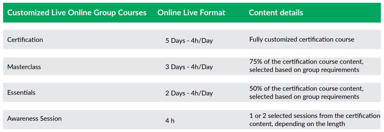
The delivery format also gives organizations greater flexibility. Sessions can take place over consecutive days within one week or across selected days over two or more weeks. Each session lasts up to four hours, which gives participants time to attend training while continuing with their regular responsibilities.

What participants can expect

The KPI Institute’s customized live online group training programs include:

  • Flexible scheduling
    Organizations select a schedule that aligns with business requirements and team availability.
  • Customized course content
    Course materials, case studies, and practical exercises reflect the group’s industry, business functions, and learning priorities.
  • Business continuity
    Four-hour sessions allow participants to continue with daily responsibilities while attending live instruction.
  • Virtual collaborative learning
    Interactive discussions, group activities, and digital collaboration tools encourage knowledge sharing throughout the program.
  • Cost efficiency
    Organizations can save up to 40% compared with traditional face-to-face in-house training because travel, accommodation, venue, and other logistical costs do not apply.

Learning topics available for customization

Organizations can customize live online training across The KPI Institute’s professional learning portfolio:

  • Certified KPI Professional and Practitioner
    Learn how to select, document, monitor, and report Key Performance Indicators that support organizational objectives.
  • Certified OKR Professional
    Build practical knowledge on designing and implementing Objectives and Key Results across teams.
  • Certified Strategy and Business Planning Professional
    Study frameworks and methods used to develop and execute strategic and business plans.
  • Certified Performance Management Professional
    Explore approaches to organizational performance measurement, reporting, and decision-making.
  • Certified Strategy and Performance Maturity Assessment Professional
    Assess the maturity of performance management systems through structured methodologies.
  • Certified Employee Performance Management Professional
    Examine performance planning, employee evaluation, coaching, and development practices.
  • Certified Data Analysis Professional
    Develop skills for collecting, analyzing, and interpreting business data.
  • Certified Data Visualization Professional
    Present complex information through dashboards, charts, and visual reporting techniques.
  • Certified Benchmarking Professional
    Learn structured benchmarking methods to compare practices and performance with industry peers.
  • Certified Balanced Scorecard Management System Professional
    Understand the Balanced Scorecard framework and its application in strategy execution.
  • Certified Agile Strategy Execution Professional
    Explore agile practices that support strategy implementation in changing business environments.

Organizations may also choose the learning format that best fits their objectives:

For more than 20 years, The KPI Institute has supported professionals and organizations through research, consulting, audit services, publications, and training in strategy and performance management. The customized live online group training programs add another learning option for organizations that want training built around their own priorities, people, and schedules.

Learn more

Organizations interested in arranging a customized live online group training program can contact the regional representative below.

Middle East

Teodora Gorski
Managing Director, MENA
E: teo.gorski@kpiinstitute.com
M: +971 55 787 6427

_____________________________

Asia Pacific

Sasikala Annamalai
Sales Director, Southeast Asia
E: sasikala.annamalai@kpiinstitute.com
M: +60 12 591 1366

_____________________________

Rest of the World

Alexandru Muntean
Head of Customer Engagement
E: alex.muntean@kpiinstitute.com
M: +40 747 060 997

__________________________________________________________________________________________

The KPI Institute is a global leader in business performance research and solutions, specializing in practice domains including strategy, key performance indicators (KPIs), employee performance, customer service, and innovation management. For over 20 years, The KPI Institute has established international standards and best practices for KPIs across both private and public sectors.

What We Offer:

  • Certifications & Training: Practical programs delivered worldwide—live online, offsite, and customized—spanning 6 continents and 7 offices in Australia, Southeast Asia, Europe, and the Middle East.
  • Knowledge Platforms: Access to www.smartKPIs.com, the world’s largest documented database of KPIs, with over 21,600 examples published and 148,000+ members in our online communities.
  • Publications: Over 460 publications, including books, research papers, and practical guides, providing insights to enhance organizational performance.
  • Advisory & Implementation Support: Expert guidance to apply insights in practice for measurable impact.

Our Reach and Impact:

  • 81,000+ companies registered on our platforms
  • 2.5 million+ professionals reached through training and knowledge services
  • 128 research client countries and 120 global partner organizations

Website: www.kpiinstitute.org

Email: office@kpiinstitute.org

LinkedIn: The KPI Institute

What really causes strategic initiatives to lose momentum?

June 25th, 2026 Posted by Certifications, Courses, E-learning, Professional Development, Strategy 0 thoughts on “What really causes strategic initiatives to lose momentum?”

Organizations rarely struggle to come up with strategic initiatives.

Leadership teams spend weeks or even months on planning sessions. Objectives become clear. Roadmaps receive approval. Budgets follow. Teams know what they need to accomplish.

Then something changes.

New priorities emerge. Resources shift. Urgent operational work begins to compete with long-term goals. Before long, strategic initiatives lose momentum.

This challenge has led many organizations to adopt more agile approaches to strategy execution. The KPI Institute has long advocated this approach through its research and professional education. The principles behind agile strategy execution focus on regular prioritization, disciplined performance reviews, and continuous alignment between strategic objectives and day-to-day work. These principles also form the foundation of The KPI Institute’s Certified Agile Strategy Execution Professional course.

This pattern appears across industries. According to the Project Management Institute’s Pulse of the Profession research, organizations with mature project and execution practices report stronger business performance and lower levels of wasted investment than their peers.

Priorities need regular review

Organizations rarely pursue a single initiative at a time.

Most manage a portfolio of projects, transformation programs, operational improvements, and compliance requirements. Each initiative competes for attention, funding, and people.

Without a clear process for prioritization, teams can spread their efforts too thin. Critical initiatives move forward at a slower pace while lower-impact work continues simply because it started months earlier.

Successful organizations review priorities on a regular basis. They ask difficult questions. Does this initiative still support strategic objectives? Does it deserve the same level of investment today? Has another opportunity become more urgent?

These conversations help leaders focus resources where they matter most.

Four questions every strategy review should answer

A strategy review does not have to become a lengthy exercise. A few well-chosen questions can reveal whether strategic initiatives still deserve attention and resources.

Ask these questions:

  • Does this initiative still support at least one strategic objective?
  • Are the expected business benefits still realistic?
  • Has another initiative become a higher priority?
  • What obstacle is slowing progress, and who owns the next action?

These questions create a simple structure for executive discussions. They also reduce the risk of keeping initiatives alive simply because time or money has already gone into them.

Practical tools that support strategy execution

Clear discussions need clear documentation. Many organizations rely on simple tools that keep strategic initiatives organized and make review meetings more productive.

Some of the most common tools include:

  • Initiative portfolios to compare priorities across the organization.
  • Benefits realization registers to monitor expected business outcomes.
  • Initiative description forms that define ownership, timelines, milestones, and success criteria.
  • Performance reports and scorecards that track progress against strategic objectives.
  • Process maps that clarify complex initiatives and identify bottlenecks.

These tools create consistency across the execution process. They also give leaders better information when priorities need to change.

Progress deserves more than status updates

Many organizations rely on project updates to monitor strategic initiatives.

Completion percentages and milestone reports have their place. They show whether activities move forward.

Business leaders also need answers to different questions.

What results has the initiative produced so far? Do the expected benefits still look realistic? Have new risks appeared? Does the initiative still support current business priorities?

A structured review process creates room for these discussions. It shifts attention from activity to business outcomes and gives decision-makers stronger evidence when plans require adjustment.

Strategy works best when teams stay connected

Even well-designed initiatives can lose momentum when departments work in isolation.

Marketing, operations, finance, and human resources often contribute to the same strategic objective. If each function follows separate priorities without regular coordination, progress slows. Small disconnects grow into larger obstacles over time.

Frequent communication and shared visibility help teams stay aligned. Leaders gain a clearer picture of progress across the organization. Employees also understand how their work contributes to broader business objectives.

Adaptability supports long-term execution

Business conditions rarely stay the same for long.

A strategy may remain relevant while the path toward it changes. Customer expectations shift. New technologies appear. Market conditions create fresh opportunities or new constraints.

Organizations that review initiatives on a regular basis can adjust timelines, redistribute resources, or revise priorities without losing sight of strategic objectives.

This approach reflects the principles of agile strategy execution. Teams continue to move toward long-term goals while they respond to changing business conditions with discipline and consistency.

Building stronger strategy execution skills

These practices require more than experience alone. Professionals also need practical methods for initiative prioritization, portfolio development, benefits realization, performance reporting, and agile organizational practices.

The KPI Institute’s Certified Agile Strategy Execution Professional course covers these topics through a structured learning experience. Participants explore strategy execution frameworks, initiative planning, portfolio development, benefits realization, performance reviews, and agile organizational practices. Practical exercises and assessments give participants the opportunity to apply these concepts to realistic business scenarios.

Strategic initiatives rarely lose momentum because organizations lack ambition. Priorities shift. Resources become stretched. Execution practices fall behind business needs.

Professionals who want a more structured approach to strategy execution can build these capabilities through dedicated learning. To learn more about The KPI Institute’s Certified Agile Strategy Execution Professional course and reserve a place in an upcoming cohort, visit the course page and complete the registration process.

KPI and business strategy courses

__________________________________________________________________________________________

The KPI Institute is a global leader in business performance research and solutions, specializing in practice domains including strategy, key performance indicators (KPIs), employee performance, customer service, and innovation management. For over 20 years, The KPI Institute has established international standards and best practices for KPIs across both private and public sectors.

What We Offer:

  • Certifications & Training: Practical programs delivered worldwide—live online, offsite, and customized—spanning 6 continents and 7 offices in Australia, Southeast Asia, Europe, and the Middle East.
  • Knowledge Platforms: Access to www.smartKPIs.com, the world’s largest documented database of KPIs, with over 21,600 examples published and 148,000+ members in our online communities.
  • Publications: Over 460 publications, including books, research papers, and practical guides, providing insights to enhance organizational performance.
  • Advisory & Implementation Support: Expert guidance to apply insights in practice for measurable impact.

Our Reach and Impact:

  • 81,000+ companies registered on our platforms
  • 2.5 million+ professionals reached through training and knowledge services
  • 128 research client countries and 120 global partner organizations

Website: www.kpiinstitute.org

Email: office@kpiinstitute.org

LinkedIn: The KPI Institute

Why some dashboards get ignored while others drive action

June 18th, 2026 Posted by Certifications, Courses, E-learning, Professional Development, Upskilling 0 thoughts on “Why some dashboards get ignored while others drive action”

Organizations invest significant time and resources in collecting data. Dashboards track performance. Reports summarize results. Teams review metrics during meetings and use them to support decisions.

Yet many dashboards fail to achieve their purpose.

People glance at them and move on. Reports sit unopened in inboxes. Important insights get buried beneath layers of charts, colors, and numbers. The information exists, but the message does not always come through.

On the other hand, some dashboards immediately capture attention. Users know where to look, what matters, and why it matters. These dashboards support discussions, highlight opportunities, and help teams make decisions with greater confidence.

What separates one from the other?

Clarity beats complexity

A common misconception is that more information creates better reporting.

In practice, the opposite often happens.

When dashboards contain too many metrics, excessive filters, or multiple chart types competing for attention, users can struggle to identify the main takeaway. Important information gets lost in the noise.

Effective dashboards prioritize clarity. They focus attention on the metrics that matter most and present information in a way that is easy to interpret.

Before adding another chart or KPI, it helps to ask a simple question: what should the audience understand after viewing this dashboard?

If the answer is unclear, the dashboard may need refinement.

Good design influences decision-making

Design is often treated as a cosmetic consideration. In reality, it plays a significant role in how people interpret information.

Color, spacing, typography, and layout affect where readers focus their attention. Poor design choices can make reports difficult to read. Strong design choices can help users identify patterns and insights much faster.

Consider the use of color. Many dashboards rely on bright colors for every metric. When everything stands out, nothing stands out. Strategic use of color creates contrast and directs attention toward the most important information.

The same principle applies to layout. Information should follow a logical flow. Readers should not have to search for key findings.

Small design decisions can have a substantial impact on how effectively data is communicated.

The audience should influence the dashboard

One dashboard rarely works for every stakeholder.

Executives often prefer high-level summaries. Analysts may require detailed breakdowns. Operational teams usually focus on day-to-day performance indicators.

Problems arise when reports are created without considering who will use them.

A dashboard that overwhelms senior leaders with unnecessary detail may go unread. A dashboard that lacks sufficient depth may frustrate analysts who need additional context.

Strong data visualization starts with audience awareness. Understanding stakeholder needs helps determine which metrics to include, which charts to use, and how information should be organized.

Data storytelling provides context

Charts display information. Stories explain why that information matters.

Imagine a dashboard showing that customer satisfaction has dropped by five percent. The number itself is useful, but questions quickly follow. What caused the decline? Which customer groups were affected? Is this part of a longer trend?

Data storytelling helps answer these questions.

It connects metrics to business objectives, explains context, and highlights implications. This makes information easier to interpret and discuss.

Professionals who can combine visualization with storytelling often produce reports that spark conversations rather than simply display numbers.

Technical skills remain essential

Design principles and storytelling provide direction, but technical skills still play an important role.

Many organizations rely on tools such as Excel and Power BI to create dashboards, scorecards, and reports. These platforms offer extensive capabilities, but effective results depend on how those capabilities are applied.

Knowing how to build a dashboard is important. Knowing how to build one that supports understanding and action is even more important.

This is where structured learning can help bridge the gap between technical proficiency and effective communication.

Developing the skills behind effective dashboards

The skills discussed above are not limited to experienced analysts or designers. They can be learned, practiced, and refined over time.

These are precisely the areas covered in The KPI Institute’s Certified Data Visualization Professional course.

The program explores visual communication principles, graphical design, dashboard development, balanced scorecards, and data storytelling, while also providing practical experience in Excel and Power BI.

Designed for professionals who work with reports, dashboards, and business data, the 40-hour course combines theory with application through live online sessions, guided learning activities, assessments, and practical exercises. Participants gain a structured understanding of how to create visualizations that communicate information clearly and support business decisions.

The difference between a dashboard that gets ignored and one that drives action often comes down to communication. For professionals who want to strengthen that capability, The KPI Institute’s Certified Data Visualization Professional course offers a practical pathway to build the skills that modern organizations increasingly expect. To learn more and reserve a seat in an upcoming cohort, visit the course page and complete the registration process.

KPI and business strategy courses

__________________________________________________________________________________________

The KPI Institute is a global leader in business performance research and solutions, specializing in practice domains including strategy, key performance indicators (KPIs), employee performance, customer service, and innovation management. For over 20 years, The KPI Institute has established international standards and best practices for KPIs across both private and public sectors.

What We Offer:

  • Certifications & Training: Practical programs delivered worldwide—live online, offsite, and customized—spanning 6 continents and 7 offices in Australia, Southeast Asia, Europe, and the Middle East.
  • Knowledge Platforms: Access to www.smartKPIs.com, the world’s largest documented database of KPIs, with over 21,600 examples published and 148,000+ members in our online communities.
  • Publications: Over 460 publications, including books, research papers, and practical guides, providing insights to enhance organizational performance.
  • Advisory & Implementation Support: Expert guidance to apply insights in practice for measurable impact.

Our Reach and Impact:

  • 81,000+ companies registered on our platforms
  • 2.5 million+ professionals reached through training and knowledge services
  • 128 research client countries and 120 global partner organizations

Website: www.kpiinstitute.org

Email: office@kpiinstitute.org

LinkedIn: The KPI Institute

Recent Comments

    Archives