Posts tagged "Data Visualization"

Why some dashboards get ignored while others drive action

June 18th, 2026 Posted by Certifications, Courses, E-learning, Professional Development, Upskilling 0 thoughts on “Why some dashboards get ignored while others drive action”

Organizations invest significant time and resources in collecting data. Dashboards track performance. Reports summarize results. Teams review metrics during meetings and use them to support decisions.

Yet many dashboards fail to achieve their purpose.

People glance at them and move on. Reports sit unopened in inboxes. Important insights get buried beneath layers of charts, colors, and numbers. The information exists, but the message does not always come through.

On the other hand, some dashboards immediately capture attention. Users know where to look, what matters, and why it matters. These dashboards support discussions, highlight opportunities, and help teams make decisions with greater confidence.

What separates one from the other?

Clarity beats complexity

A common misconception is that more information creates better reporting.

In practice, the opposite often happens.

When dashboards contain too many metrics, excessive filters, or multiple chart types competing for attention, users can struggle to identify the main takeaway. Important information gets lost in the noise.

Effective dashboards prioritize clarity. They focus attention on the metrics that matter most and present information in a way that is easy to interpret.

Before adding another chart or KPI, it helps to ask a simple question: what should the audience understand after viewing this dashboard?

If the answer is unclear, the dashboard may need refinement.

Good design influences decision-making

Design is often treated as a cosmetic consideration. In reality, it plays a significant role in how people interpret information.

Color, spacing, typography, and layout affect where readers focus their attention. Poor design choices can make reports difficult to read. Strong design choices can help users identify patterns and insights much faster.

Consider the use of color. Many dashboards rely on bright colors for every metric. When everything stands out, nothing stands out. Strategic use of color creates contrast and directs attention toward the most important information.

The same principle applies to layout. Information should follow a logical flow. Readers should not have to search for key findings.

Small design decisions can have a substantial impact on how effectively data is communicated.

The audience should influence the dashboard

One dashboard rarely works for every stakeholder.

Executives often prefer high-level summaries. Analysts may require detailed breakdowns. Operational teams usually focus on day-to-day performance indicators.

Problems arise when reports are created without considering who will use them.

A dashboard that overwhelms senior leaders with unnecessary detail may go unread. A dashboard that lacks sufficient depth may frustrate analysts who need additional context.

Strong data visualization starts with audience awareness. Understanding stakeholder needs helps determine which metrics to include, which charts to use, and how information should be organized.

Data storytelling provides context

Charts display information. Stories explain why that information matters.

Imagine a dashboard showing that customer satisfaction has dropped by five percent. The number itself is useful, but questions quickly follow. What caused the decline? Which customer groups were affected? Is this part of a longer trend?

Data storytelling helps answer these questions.

It connects metrics to business objectives, explains context, and highlights implications. This makes information easier to interpret and discuss.

Professionals who can combine visualization with storytelling often produce reports that spark conversations rather than simply display numbers.

Technical skills remain essential

Design principles and storytelling provide direction, but technical skills still play an important role.

Many organizations rely on tools such as Excel and Power BI to create dashboards, scorecards, and reports. These platforms offer extensive capabilities, but effective results depend on how those capabilities are applied.

Knowing how to build a dashboard is important. Knowing how to build one that supports understanding and action is even more important.

This is where structured learning can help bridge the gap between technical proficiency and effective communication.

Developing the skills behind effective dashboards

The skills discussed above are not limited to experienced analysts or designers. They can be learned, practiced, and refined over time.

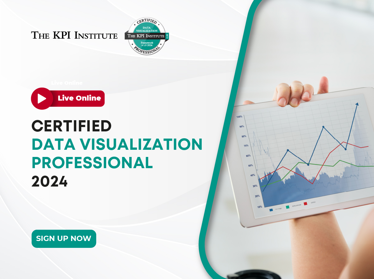
These are precisely the areas covered in The KPI Institute’s Certified Data Visualization Professional course.

The program explores visual communication principles, graphical design, dashboard development, balanced scorecards, and data storytelling, while also providing practical experience in Excel and Power BI.

Designed for professionals who work with reports, dashboards, and business data, the 40-hour course combines theory with application through live online sessions, guided learning activities, assessments, and practical exercises. Participants gain a structured understanding of how to create visualizations that communicate information clearly and support business decisions.

The difference between a dashboard that gets ignored and one that drives action often comes down to communication. For professionals who want to strengthen that capability, The KPI Institute’s Certified Data Visualization Professional course offers a practical pathway to build the skills that modern organizations increasingly expect. To learn more and reserve a seat in an upcoming cohort, visit the course page and complete the registration process.

KPI and business strategy courses

__________________________________________________________________________________________

The KPI Institute is a global leader in business performance research and solutions, specializing in practice domains including strategy, key performance indicators (KPIs), employee performance, customer service, and innovation management. For over 20 years, The KPI Institute has established international standards and best practices for KPIs across both private and public sectors.

What We Offer:

  • Certifications & Training: Practical programs delivered worldwide—live online, offsite, and customized—spanning 6 continents and 7 offices in Australia, Southeast Asia, Europe, and the Middle East.
  • Knowledge Platforms: Access to www.smartKPIs.com, the world’s largest documented database of KPIs, with over 21,600 examples published and 148,000+ members in our online communities.
  • Publications: Over 460 publications, including books, research papers, and practical guides, providing insights to enhance organizational performance.
  • Advisory & Implementation Support: Expert guidance to apply insights in practice for measurable impact.

Our Reach and Impact:

  • 81,000+ companies registered on our platforms
  • 2.5 million+ professionals reached through training and knowledge services
  • 128 research client countries and 120 global partner organizations

Website: www.kpiinstitute.org

Email: office@kpiinstitute.org

LinkedIn: The KPI Institute

Certified Data Visualization Professional: unveil the meaning behind numbers

August 7th, 2024 Posted by Certification 0 thoughts on “Certified Data Visualization Professional: unveil the meaning behind numbers”

Is data analytics in your organization struggling to make an impact on decision making and lead the road for better results? You are not alone. Only 26.5% of responding companies in the 2022 Big Data and AI Executive survey reported themselves as having successfully transformed into data-driven organizations. Over 90% of executives saw the greatest barrier against being data-driven is the organization’s culture and employees’ skills.

The set of skills that is crucial for data-driven transformation lies under the umbrella of data literacy, which 82% of managers expect all employees to have, according to another survey by Forrester. Yet, only 40% of employees say they are provided with the data skills they are expected to have.

One of the main ways of cutting through this data literacy gap and initiating its development within an organization is to implement good data visualization practices. To inform, persuade and engage employees and managers at different levels, nothing is better than transforming cold numbers into well-crafted visuals presented in the proper context.

Implementing good data visualization practices is the main goal of the Certified Data Visualization Professional course of The KPI Institute. 

Course overview

This course will improve communication within your company through visual displays. Through practical applications, you will learn how to communicate visually in an effective way and how to increase reporting efficiency, leading to a better understanding of the presented data, and thus, to smarter and quicker strategic decisions.

The course approaches its goal of helping organizations implement optimal data visualization practices through ensuring that participants are able to:

  • Identify data visualization fundamentals and best practices
  • Apply data reporting principles in business settings
  • Generate optimal graphs, data presentations, dashboards and BSCs, using Microsoft Excel, PowerPoint and PowerBI
  • Acquire the ability to critique data visualizations based on well-established concepts and assessments

Benefits and importance

By becoming a Certified Data Visualization Professional, you will gain a wide range of benefits that include:

  • Receiving relevant guidance for developing visual representations in order to discover, understand and communicate information
  • Creating better and more relevant reports by understanding the fundamental concepts in data visualization
  • Offering intelligible data sets to decision-making parties through creating excellent graphical representations
  • Improving your performance in presenting data and enhance viewer experience
  • Gaining access to a wide variety of templates, toolkits and resources developed by The KPI Institute
  • Obtaining 40 CPD credits to include in your CPD records for your professional body, institute, regulator or employer

Course structure and methodology

The course encompasses a three-stage educational process with an expected duration of 40 hours:

  1. Pre-course stage: This stage ensures a seamless transition into the training program. You will evaluate your current skills, join an interactive online forum, and understand the groundwork for a collaborative learning journey.
  2. Core-course stage: Participants can choose between attending live online sessions or engaging in face-to-face interactions. They will engage in experiential learning and a high level of interactivity, complete their Individual Learning Maps, and take the certification exam.
  3. After-course stage: You will be a part of thought-provoking forum discussions and explore additional readings. You will be able to create an actionable plan based on your organization’s needs.

Course syllabus

The core course comprises 11 learning modules:

  1. Data visualization parameters
  2. Data collection and preparation
  3. Visual communication channels
  4. Visualization structure
  5. Visualization format
  6. Visualization expression
  7. Pivot charts in Excel
  8. Data presentations in PowerPoint and Excel
  9. Dashboards in Excel and PowerBI
  10. Scorecards in Excel
  11. Visualization assessment

Flexible learning options

The KPI Institute offers this course in both face-to-face and live training formats, scheduled around the year to accommodate different format and time preferences.

Certification and recognition

Upon completion, participants will receive the following certificates (soft copy):

  • Certificate of Attendance: for course sessions participation
  • Certificate of Completion: after fulfilling pre-course activities and passing the Certification Exam
  • Certified Professional Diploma: upon successfully completing all three stages of the learning experience and once the full payment has been received by the contractor
  • CPD Certificate of Attendance: provided once you achieve Professional Status

Don’t you think it’s time for your organization to leverage its data insights for greater impact? Become a Certified Data Visualization Professional. Enroll today and invite your colleagues!

Data Visualization: Definition, Trends, Tools, and Learning Opportunities

January 8th, 2022 Posted by Certification, Courses, E-learning 0 thoughts on “Data Visualization: Definition, Trends, Tools, and Learning Opportunities”

The global data visualization market size hit USD 9.48 Billion in 2020 and is projected to reach USD 20.16 Billion by 2028. What is data visualization, and why is it so important?

Emergen Research attributes its optimistic forecast to the “generation of large data volumes and the rising need for multi-device access facilities.” It added that cloud computing and the need for fast decision-making, particularly during volatile times, are also accelerating the adoption of data visualization.

The rise of Augmented Reality (AR) and Virtual Reality (VR) that help companies process data in 3D formats pushes the demand for cloud computing in data visualization, according to Emergen Research. These are further driving the market revenue growth.

The KPI Institute defines data visualization as “the visual representation of data, in order to better understand information and present it in a clear and effective manner.” Data visualization can help detect and analyze patterns, trends, and correlations.

According to the report “TDWI best practices report: Data visualization and discovery for better business decisions,” some of the benefits of data visualization are the improvement of operational efficiency, better response to business changes, identification of new business opportunities, and higher employee and partner productivity. 

Based on Emergen Research’s findings, the software segment revenue would increase steadily during the firm’s forecast period. Moreover, the standalone visualization software segment revenue is soaring due to the need to produce useful information from huge volumes of data. Such data usually comes nowadays from social media and other online platforms. “Use of data visualization software such as Oracle, tableau, and SAP made this approach feasible,” the forecast report states.

Developing and designing a visual representation is not a walk in the park. To communicate data visually and effectively, you need the right tools, knowledge, and expert guidance. 

The KPI Institute’s Certified Data Visualization Professional course teaches participants how to create better and more relevant reports and present intelligible data sets to decision-makers. If you would like to improve the visual communication within your organization, secure your slot on 21 – 25 February 2022 (EMEA: 09:00 – 13:00 GST and ASEAN: 13:00 – 17:00 GMT +8) by signing up here.

online

Multiple TKI Live Online certification courses now available in Arabic

July 23rd, 2020 Posted by E-learning 0 thoughts on “Multiple TKI Live Online certification courses now available in Arabic”

Excellence is a product of knowledge that has been molded and adapted as each situation saw fit. We at The KPI Institute pride ourselves on delivering excellence with each of our courses. online

Since our transition into the online environment, we have seen growing interest in our Arabic-delivered courses. We used to only feature one of our courses in Arabic, namely the Certified KPI Professional course, but now we have decided to increase the roster of certification opportunities available in Arabic.

As a result, all of the following live online courses now feature a standalone version, in Arabic:

  • Certified Strategy and Business Planning Professional
  • Certified Balanced Scorecard Management System Professional
  • Certified Performance Management Professional
  • Certified Data Analysis Professional
  • Certified Data Visualization Professional
  • Certified KPI Professional

You can become a certified Performance Management practitioner, from the comfort of your home. Excellence and improvement know no boundaries, no restraints and no barriers.

In the pursuit of greatness, we have to overcome all of the challenges laid before us. We have decided to meet our attendees half-way and provide a customized, tailored learning experience, which answers their needs to a tee. Meet attractive and sexy yerevan escort girls who can make your stay in the city unforgettably perfect.

If you are located in the Arab world, and wish to add your name to the ranks of all those holding a worldwide recognized certification from The KPI Institute, consider joining any of our live online courses. Excellence is just a click away!

visualization professional

Certified Data Visualization Professional – 20 – 24 July

June 30th, 2020 Posted by E-learning 0 thoughts on “Certified Data Visualization Professional – 20 – 24 July”

Visual communication is effective only when it is aligned with the way people see and think. The course provides insights on the importance of data visualization, its fundamental principles, as well as the means to increase non-verbal communication skills through effective visualizations.visualization professional

A visualization professional improves the overall communication level within their company, through the use of smart & intuitive visual displays. As a future visualization professional, you will learn, through practical applications, how to communicate visually in an effective manner, and how to increase reporting efficiency, which will lead to a better understanding of the presented data, and thus, to smarter and quicker strategic decisions.

This 40-hour learning experience spans over 5 days and ends in a 1-hour certification exam.

What will you learn

  • Understand the fundamentals of creating and designing a visual representation for your intended users;
  • Select the right communication channel in accordance with the target audience;

What’s in it for you – Benefits

  • Receive relevant guidance for developing visual representations, in order to discover, understand and communicate information;
  • Create better and more relevant reports, by understanding the fundamental concepts of data visualization;
  • Offer intelligible data sets to decision-making parties, by creating excellent graphical representations;
  • Improve your performance in presenting data and enhance the overall viewer experience.

Presenter profile

Fadi Fuad Al-Jafari is a Management Consultant at The KPI Institute, specialized in Data Analysis and Visualization.

Fadi has a Bachelor’s Degree in Communication Engineering from Al-Balqa Applied University in Jordan, and a Master’s Degree in Business Administration from the German Jordanian University in Jordan.

Fadi is a Certified Project Manager Professional, has several certifications in Statistics Foundation, Data Analysis using Excel, Analyzing and Visualizing Data with Excel, Working with Real-Time Data in Excel, Excel Macros in Depth, Predictive Analytics using BigML, Train the Trainers, and has been part of several Data Analysis-related projects in the last years.

He has worked on a wide array of projects, such as Network Statistics Reporting Tool, Network Operation Center Balanced Scorecard, Business Specification Documents for Network Operations Center, Zain’s Procedures Alignment with APQC’s PCF, Robotic Process Automation for Network Operation.

The KPI Institute’s coverage of PMA 2014 Conference

July 22nd, 2014 Posted by Events 0 thoughts on “The KPI Institute’s coverage of PMA 2014 Conference”

The KPI Institute’s participation at the PMA 2014 Conference, held in Aarhus, Denmark had as a main outcome the achievement of a full and comprehensive conference cover. PERFORMANCE Magazine, The KPI Institute’s magazine dedicated to performance and strategy, provides an extensive database that comprises 11 interviews with professionals, as well as coverage from roughly over 80 presentations delivered by speakers all throughout the 3 days of conference.

PMA2014

(more…)

Recent Comments

    Archives